Thursday 28 November 2013

Questionnaire results

From these results you can see that the people that did the questionnaire the most was people between 17-21 followed by people from the ages 22-30 and 12-16 , this is because my target audience will be people of this age as they are mostly interested in music.
For this question people preferred the contents page layout that had many different blocks with pictures placed inside of them. This would allow me to place more images on to the contents page.
The fact that most of the people said that they follow the fashion that music artists wear would mean that I can talk about the fashion that the music artists wear on my double page spread when I make it. when taking pictures I can focus on costume
 The genders of the people that I asked were mostly equal, this is because my target audience for my magazine is both male and female, so when asking my questions to people I had to make sure that they were equally spread and that I was getting the correct information that I wanted.

 most of the people that I gave my questionnaires to said that they do not read music magazines, but the people that did said that they read NME, this shows that my audience likes new music, so this would mean that I can put in new music to my magazine.
 The masthead name that was preferred was 'friction' this helped me to decide what the best name was, the one that was most effective and the one that people would like which would mean that the audience would be able to remember the name more easily.
My audience said that the most that they would pay for the magazine is £2, this means that on the cover the price would attract people to buy the magazine. Although if the magazine was actually to become a real magazine then the quality of the paper and celebrities that would be in it would be low. 
 Not many people would buy the music magazines regularly, this is because most of the audience that I asked do not buy music magazines and they said that the most that they would pay for a magazine in £2 so the magazines may be expensive for them to buy.
what people wanted to see in the magazines is equally distributed. People want to see many different things in the magazine. some people said other and when asked what else they said fashion articles and life stories of the celebrities/interviews so that they can see the inside life of the celebrity that they like.


The genre of music that my audience like the most is R&B, although a lot of my audience like to listen to more than one type of music genre, which gave me a large selection of people that would be in my music magazine. When asking other people said they like Bhangra and Dance (dubstep/garage).


Who are your three favourite music artists?

When I asked this question I got many different responses that I have narrowed down to the top ten, the top ten were

  • Drake
  • The Weeknd
  • Jaz Dhami
  • Rihanna
  • Lomaticc
  • PBN
  • Jazzy B
  • J cole
  • PMC
  • A$AP
From these results I can distinguish the type of people that my audience are interested in and who they like listening to. The results that I have got vary between different genres of music, showing that my audience do not only listen to one type of music but listen to a range of music that could be included into my music magazine.

What attracts you to the magazine?

People said that things like the people that are featured on the magazine attracts them to it because they would be interested. They also said that they are attracted by the colour of the magazine because it makes it stand out from the rest of the magazines that are displayed in the shop. People also said that the magazine looks more attractive when there is not too much font to read as people do not have time to read the magazine cover in the shop to see all the things that are in the magazine.


Wednesday 27 November 2013

Front cover layouts

A layout plan is a rough plan of what the layout looks like with the use of images and a little bit of text.


For the first two layouts I have designed them to be in more of a traditional way, the type that you will see when you usually buy magazines. The visual syntax of these will make it easy to read and follow. The house style of it is very simple and it will make it be easy to recognise the magazine cover. The image that is behind will cover up the page. These are potential ideas that I will do for my magazine front cover as I think that it can be effective because other magazines use it and are successful.
For these two layouts I have set it out so that it is more picture dominated and that there is very little text that is on the magazine cover. The house style of the cover is very simple and even though that it can be effective it can look very plain and needs to be made in a certain way. If I make this magazine cover then it can be difficult to do as you would need to have very skilled photography skills as the image would be the main thing that you can see on it. 
This magazine front cover is a text dominated layout, there would be a lot of text and information that is shown on the cover. This may put people off from buying the magazine as people like simple magazines that they can quickly read the information off from.On the first image the picture that would be in the middle would be covered up and you will not be able to see most of the image. The front covers don't look attractive because of all the writing that is on them.
On these layouts I have made them to have two images on them, in the background there would be an image of the famous person that the magazine issue would be about and in the smaller box I will put an image of something else that would be featured in the magazine. I feel that the last one would be potentially better than the first one because the image would be smaller and as it is higher up it will not get in the way of the main image where as the first one is in the middle and can get in the way of the magazine.

Tuesday 19 November 2013

Masthead ideas 1

These are mastheads that I have created on Adobe Fireworks, I have used the fonts that the program provides for the user, I am now going to use fonts that can be found on the internet as there is a wider variety that you can get off the internet and they are more interesting than the ones that adobe fireworks can offer.

Monday 18 November 2013

Representation

Representations are the way that the media portrays particular groups, communities or topics from a particular ideological or value perspective. Representation is not a real version of events it is constructed.
  • The genders in my magazine would be represented by the images that are used in the magazine, different genders are attracted to different things and they will find different things appealing. The different genders will not be portrayed in a bad way through the images, so the images that will be shown will not be too revealing as this will be a bad representation. Both male and female would be represented in the same way.
  • The different ages that will be represented vary. The people that would be in the magazines age would be young coming from the ages sixteen to thirty, this is a wide age group and it would allow there to be a larger audience that would be attracted to the magazine. Sometimes there may be some artists that are over the age of thirty as they may have a successful career which would also attract an audience as they would be famous and people would want to read about their life
  • Different races would be represented as my target audience would be from an Asian decent (Indian, Pakistani, and Bangladeshi) this is because they are mostly the people that would listen to this type of music. This type of music started in India as folk songs and then became a larger music industry especially in the UK. Most of the songs are in Panjabi lyrics which would attract a Panjabi audience. Although anyone that likes the music can listen to it, but the majority of people that will are the ones that have been stated above.
  • The other types of groups that could be represented is Asians that have made it big in other charts for example Jay Sean, Naughty boy, DJ Khalid, Priyanka Chopra and many more other people. This would attract a wider audience range as these are famous people that people already listen to and they know of them. No groups have been deliberately unrepresented, the magazine is purely for anyone that wants to buy it, although the people that would want to buy the magazine would be Asian.
  • The representation of the people in the magazine would be portrayed in a positive way; cultural reasons being that everyone should be portrayed equally and women should not be shown in a revealing light. The magazine should make the people feel happy and it should make them want to buy the magazine. If the magazine looks attractive and the people that are shown in it look appealing and happy then the people would want to buy the magazine.The representation of the magazine could be interpreted in different ways if someone who is famous from an Asian decent (Jay Sean) is on the front cover, then people would want to buy the magazine then they would carry on reading the magazine then they will not know who the other people in the magazine are.
  • The representation ideology is presented through the dominant ideology of the culture; this is having both genders portrayed in the same and correct way in a positive light. Bhangra is an old Panjabi folk music, this means that it is mostly the same and it has a lot of history to it and this means that the people that are represented may sometimes be older.


Monday 11 November 2013

Music Magazine name ideas

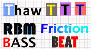
The names that I have come up with are all to do music, they are all synonyms of different words, my idea was to make the name short and catchy so that people will remember the name and it will be able to have an attractive and simple masthead that will attract an audience just like other types of magazines do. I think that I will stick to names like 'Pulse', 'Thaw', 'Beat', 'RBM' because these are small and catchy names to have the music magazine named after. RBM means rhythm bass music.

Sunday 10 November 2013

Fader


The brand identity of fader magazine is that they have a large professional picture in the background, the picture covers the whole of the page. The type of pictures that they take is mostly a close up picture, the designers of this magazine obviously take a lot of time editing the pictures and taking many different pictures to get it to the high quality that they are on.
The masthead looks professional and they keep the same font on all of them, although they change the colour of the background of the 'F' this is so that it stands out from the picture in the background and it usually matches what the person in the photo is wearing. This allows the customer to recognise the magazine. At the bottom of the page the headlines that most of the magazines have is the name of the person on the picture, this will show that the music artist will be spoken  out through the magazine and that they are the important person with in the magazine.
XXL is a hip hop magazine, their identity is the bold masthead which has a red background with large, bold writing in it with the name of the magazine, the way that the magazine is set out is with a large image placed in the center of the page. The photographer has used many different shots from close up shots to long shots. The headlines on the magazine is the name of the person in the picture which shows that they are the main person in the magazine and the audience will be able to see who they are if they do not know. The rest of the magazine front cover shows the names of the other people that shows in the magazine. With the headline it has a strapline under neath it to shows a story that is involved in the magazine.


Brand identities and values

Brand identity is the outward expression of a brand, including the name and visual appearance. The brand identity is what the customer uses to identity the product; it shows recognition and symbolizes the brands difference from the competitors. Brand identity includes things such as...
·         Masthead – visual
·         House style – definitive and distinct
·         Associations – the audience
Brand values means what the magazine stands for, for example, NME stands for new music so they feature in their magazine new music.

There are many different magazines with their own Brand Identity, the brand identities are all unique and it makes the magazine stand out. For example, magazines such as ID and fader all have simple front covers; they have a large close up image with a simple masthead and very little text. Whereas magazines such as mix mag, vibe and NME have a picture but have more text, they also change the colour of the masthead in their magazines to match the back ground.
For my magazine I would like to have it similar to fader and vibe, I would like to have these two as they both have very different brand identities, I like the way that fader take the images and the way that the masthead looks professional, but I like the way that vibe change the colour of the masthead depending on the colour of the background.  I want my magazine to stand out from the others, so I will need to make it appealing, I will do this by using good quality images, a large masthead that will catch the audiences eyes, and some interesting headlines.
The genre of my magazine will be a bhangra magazine, this will attract a large audience because there is not a magazine that is published with this genre. The magazine will include pictures of famous people. The masthead will stand out along side the the image that will be on the cover, this will attract the audience as the magazine would look aesthetically pleasing. The brand value of the magazine will be for well known bhangra music.