Wednesday 26 March 2014
Saturday 22 March 2014
Monday 17 March 2014


Sunday 16 March 2014
final improvements to DPS

Wednesday 12 March 2014
DPS improvements from previous idea

Tuesday 11 March 2014
dps mock up

DPS mock up

dps development mock up

dps mock up
Thursday 6 March 2014
DPS mock up

This is a double page layout that I have come up with, there are some good things about it and some not so good things about it and things that need to be changed, the background and the colour of the masthead could be changed as it doesn't look effective.
Tuesday 4 March 2014
mastheads

To improve my double page spread I have been trying out using different mastheads as the one I originally had (the one in blue at the bottom) didn't really link well with the page, even though my housestyle font is blue I feel that to make this page more effective I would have to use a dark shade of blue to make it look professional.
double page idea 2

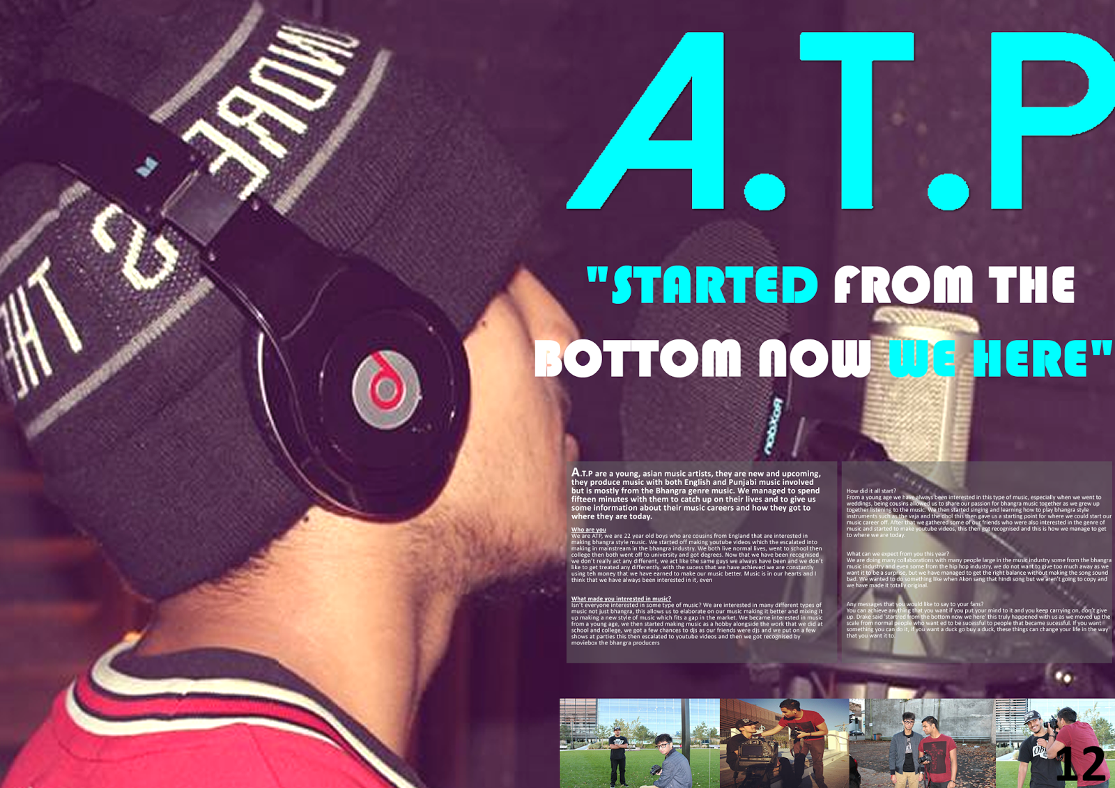
From this idea you can see the development that I have made, I have added a background image and I have added a title and a pull quote in to draw the audience into the writing in the paragraphs. More text needs to be added to make the page more full and I feel that the writing needs to be changed that has been used on the masthead as it does not fit the layout of the page.
Double page spread layout 1

To start off my double page spread layout i put in the guidelines and added some pictures, although this might change through out the process as it does not look very professional at this stage, a title also needs to be added to it and some other conventions of a contents page.
Subscribe to:
Posts (Atom)