Sunday 23 February 2014

Page furniture

Page Furniture is used to make the double page spread look unique and different to all of the other pages that contain text, it makes it look more interesting and not boring, colour and bold text is used to make it eyecatching for audience, page furniture includes...
-Pull quotes
-Cross heads
-Opinion box
-Boxouts
-Slugs
-caption/Caption header
-Byline
-Header
-Drop Cap

Double Page Spread layouts


Analysis of double page spread

Picture
The picture on the right page (long shot) stands out the most on the page, this is because it is the only thing that is in colour. The woman is wearing a red dress, red is a harsh colour so this makes it stand out from the rest of the black and white. In the picture, again like in the contents page the woman is showing alot of skin, this portrays females in a negative view again. There is a black and white banner at the top and the woman is posing in different ways, she is still wearing the same dress but the picture is in black and white so this brings more attention to the larger image of her.
Colours/house style
The colours of the font that has been used on this magazine are black grey and blue which contrast with what the R&B artist Solange Knowles is wearing.As the colours of the fonts that have been used on this article not very bright or eye catchy this shows that Solange Knowles is the core of the magazine. Her name is written in blue in the heading, this shows that people may not know who she is and therefor need to.  The blue colour makes it stand out more.
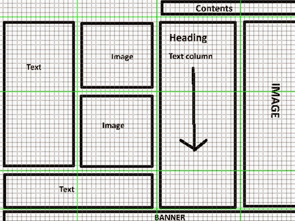
Layout
On the double page spread the author of the article has used a pull quote of what is in the magazine, this would lure the reader in even before they have read the article. It has been written in a large, bold font (the same font that has been used through out the magazine. I feel that the picture has been placed in an awkward position as it is placed in between the article, this would interrupt the visual syntax that a reader usually will have when reading an article.
Headline
There isn't a large masthead on this page but there is a quote in bold writing that would make you attracted to it, the important words are highlighted which shows that it is an important concept for that page.

Key codes and conventions of a double page spread (DPS)


Final Contents Page

My final contents page has changed dramatically from the starting point that I was at, at the start of the making process. On my final contents page I have met many of the different conventions that you would find on a contents page (Masthead, Images, Numbers, banners and much more). I have stuck with the blue theme (the house style of my magazine) as this adds effect and makes it look effective.
.


Monday 10 February 2014

contents improvements

From this you can see the improvements that I have made from the previous one, you can see the changes that I have made and  that I have tried to make it more effective, I have moved the banner from the top and added a masthead. I have also now shown a basic layout for my contents page.

Wednesday 5 February 2014

contents ideas

This is my layout for my magazine contents page, I have added some pictures, these pictures will link to a page. I have added a banner at the top and at the bottom, I have made it blue as it is the colour of the front cover and links in with the house style for my magazine. 

Tuesday 4 February 2014

content masthead ideas

These are some of the masthead ideas that I have come up with for my music magazine contents page, the way that I have created all link to the house style of my magazine, the colours that have been used are the same colours that I have used on my front cover. I have decided to use a different font to what I had used on my front cover.

Monday 3 February 2014

pictures

These are some of the pictures that I am planning to use on my music magazine contents page.


These are other images that I may use on the contents page, these are just a few ideas that I may use in my magazine contents page.

content page layouts


 For my contents page layouts I have chosen to make a double page spread of it. On these contents pages I have made sure that there will be some key conventions that you would find on a contents page which I have spoken about in a previous post.

On these contents page layouts I have shown where the text will go and the images, I have placed them in places that I would like them to go and I have included the estimated sized that I would like them to be. I have not included things like colour and font size and style as these are only layouts and this is not needed. I have made 8 different layouts, all of which are different to each other and all contain different amounts of images and text, some have more images than others whilst some have more text.