Monday, 14 April 2014


Sunday, 13 April 2014


Sunday, 6 April 2014
4) Who would be the audience for your media product?
The ideal reader
The ideal reader for my
magazine would be people of both genders from the ages of 16-30 this is because
I want to target my magazine at a niche audience and this is the age group that
would listen to Bhangra music the most, the people with in this ages group who
listen to this genre of music would be interested in some of the same things
and would come from similar social groups.
The way in which the target
market for my magazine would listen to the music would be on an ipod/Mp3
player, this is because cds are hard to get hold of with this type of music,
they would have to buy the songs off Itunes because applications like spotify
would not have many songs from this genre on it but they would have a few. Most
of my audience would still be in education, being in school, college or
university. Indians are usually stereotyped as being doctors, dentists, lawyers
or teachers so they would be either in group A or B in the Jincar scale. They
would shop in usual places like Tesco or Asda as my audience is young they
would want to go somewhere where the food is cheap and they would go to the
usual high street shops like new look, topshop to buy their clothes as they
would want to save as much money as possible. My audience would either live at
home with their parents, in a flat or have a small house; this is because again
my target audience is a young age so they would not have that much money to buy
a big house to live in. Asian people are seen as being quite religious, so they
would value religion in their life, they would also value family status as in
the asian culture this is important. When they spend their free time you would
usually see them drinking, especially if they’re Indian, Bhangra music is made
around drinking and most of the songs are about drinking so this is a big part
of their culture.
What my ideal target audience would look like...

Some of the questions that I
would ask my target audience
1)
Would you buy this magazine in
the shop if you saw the front cover?
2) Would you pay £1.99 for the magazine?
3) What attracts you to the magazine?
4) What is your favourite page?
5) What improvements would you make?
6)
Any other comments?
Response to the questions by someone from my target audience.
https://soundcloud.com/user175964735/romas-courseworkTuesday, 1 April 2014
Wednesday, 26 March 2014
Saturday, 22 March 2014
Monday, 17 March 2014


Sunday, 16 March 2014
final improvements to DPS

Wednesday, 12 March 2014
DPS improvements from previous idea

Tuesday, 11 March 2014
dps mock up

DPS mock up

dps development mock up

dps mock up
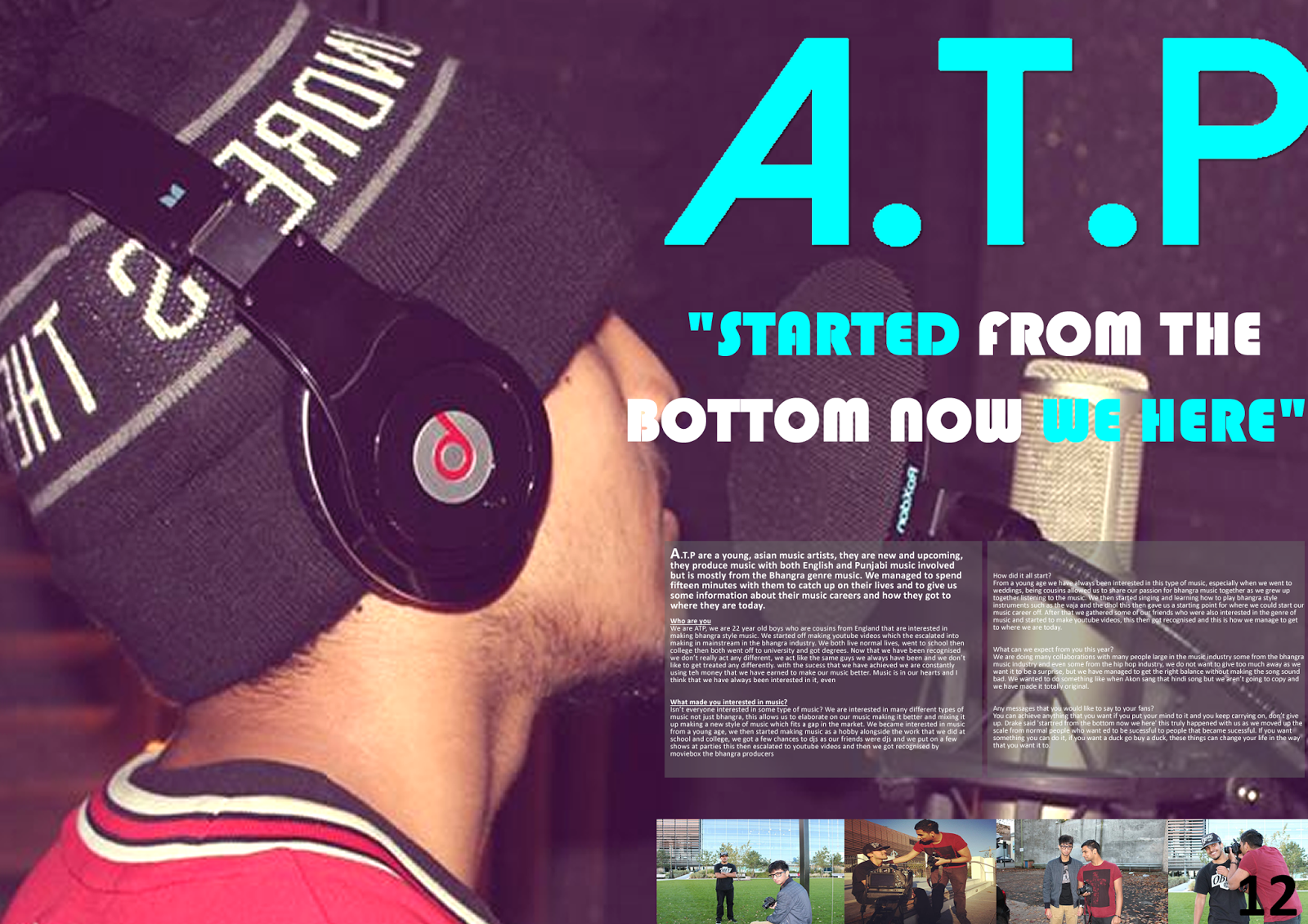
Thursday, 6 March 2014
DPS mock up

This is a double page layout that I have come up with, there are some good things about it and some not so good things about it and things that need to be changed, the background and the colour of the masthead could be changed as it doesn't look effective.
Tuesday, 4 March 2014
mastheads

To improve my double page spread I have been trying out using different mastheads as the one I originally had (the one in blue at the bottom) didn't really link well with the page, even though my housestyle font is blue I feel that to make this page more effective I would have to use a dark shade of blue to make it look professional.
double page idea 2

From this idea you can see the development that I have made, I have added a background image and I have added a title and a pull quote in to draw the audience into the writing in the paragraphs. More text needs to be added to make the page more full and I feel that the writing needs to be changed that has been used on the masthead as it does not fit the layout of the page.
Double page spread layout 1

To start off my double page spread layout i put in the guidelines and added some pictures, although this might change through out the process as it does not look very professional at this stage, a title also needs to be added to it and some other conventions of a contents page.
Subscribe to:
Posts (Atom)